September 6, 2022
I am awaiting the arrival of the first official athleisure wear collection. The college has officially placed the order and I have closed my first official wholesale deal. Over the summer I worked with Apple Creative Studios and Afro Milan Fashion Week where I networked with the likes of Lawrence Steele and created a capsule collection for Milan Fashion Week. In preparation for fashion week I began planning my arrangements and outfits. Dr. Tolliver and I discussed further plans for our course and he assigned me with a syllabus. Next, I connected with Markesha to perform a fitting with the majorette uniforms. The majorette uniform designer would conduct a fitting with the majorettes on my birthday while I am in Italy for fashion week.
September 13, 2022
I am in Italy for fashion week. In the next couple of days I will be attending the reveal of the collection at Apple Milan near Duomo. In the meantime, I had dinner with Lawrence Steele and we discussed strategies of how I can position myself in the fashion industry. I asked if he thought it was a good idea for me to come work for him at Aspesi and he declined. He told me he could get me a job at Marni, but the work environment at Aspesi was unwelcoming. We also discussed whether or not I should go to graduate school. He disagreed and told me that graduate school was a waste of time. We also discussed whether or not I should move to Milan upon graduation. He thought that Milan would be a great fit for me. His only concern was getting me validity in the country. I received a notice that the majorette fitting went well and the majorette designer received all the measurements and would create samples from S to XL.
September 20, 2022
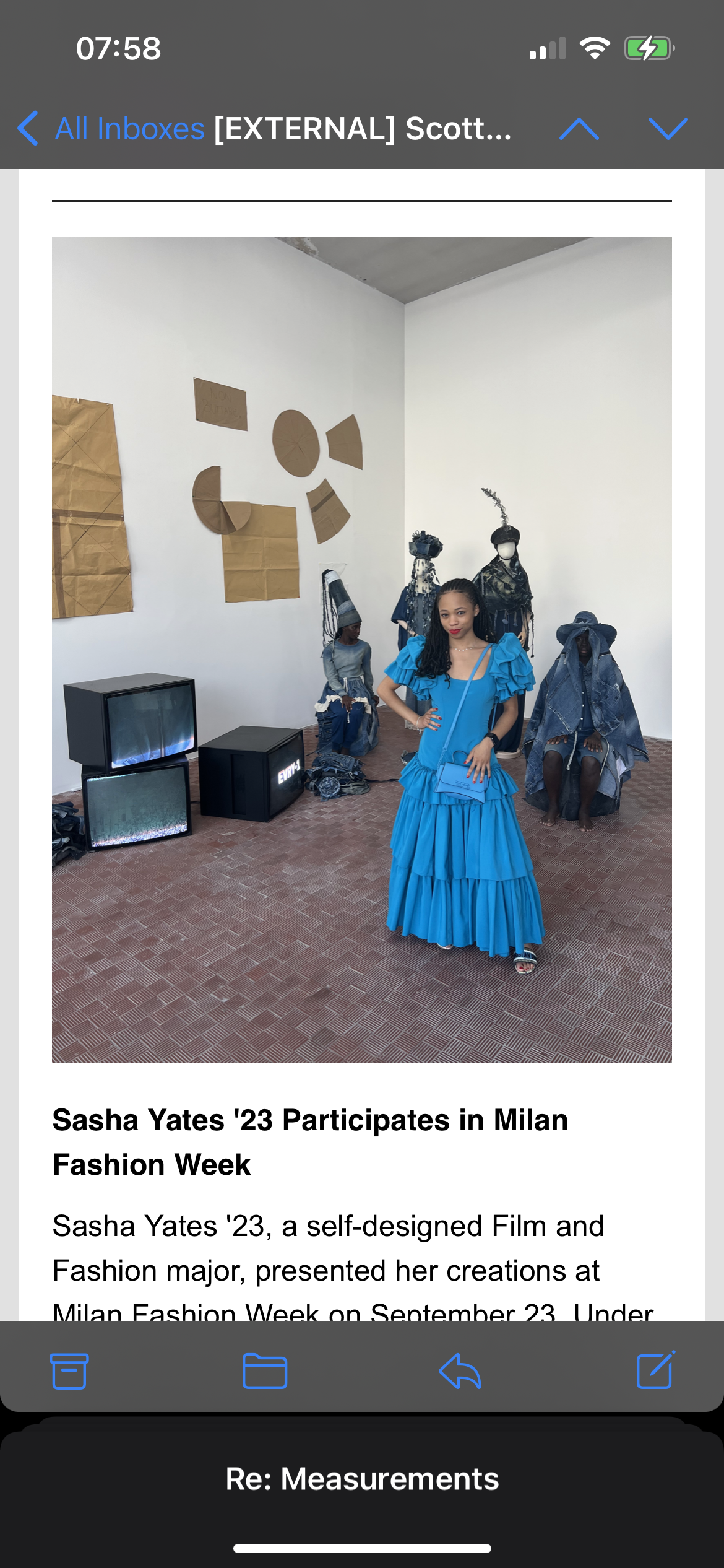
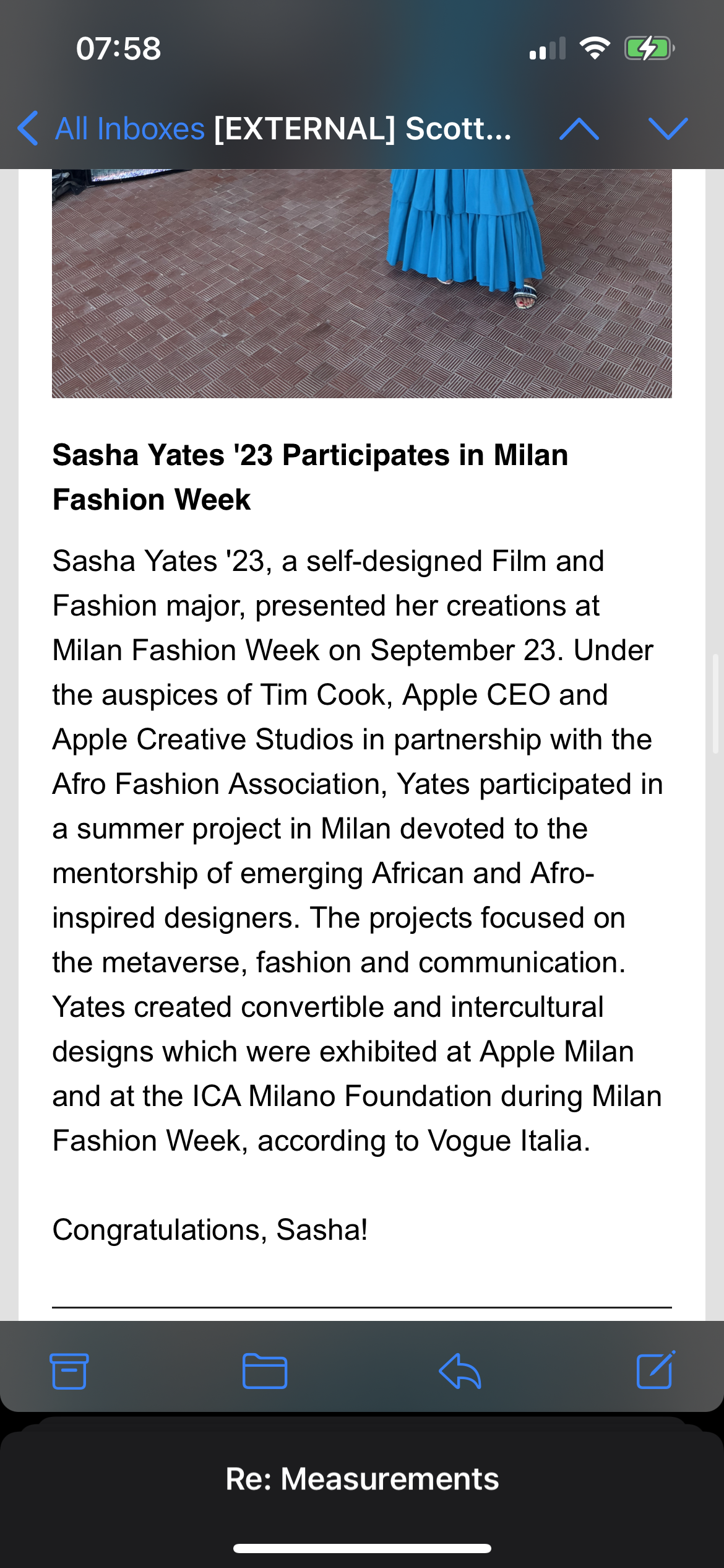
I attended the reveal of the collection at Apple Milan. I was reunited with several friends that worked alongside me on the collection. I was also able to connect with new people. The presentation happened on the screen in the back of the room. It happened during normal business hours so we had regular people who were invited to be a part of the demonstration. We showed a powerpoint of the ideation process, the sketches, the patterns, and the mood board. There was also a live demonstration of the box covers and pillows turning into hats. We were able to interact with the crowd and discuss our hats and what we felt about the experience. I talked about the Albania and Morocco hat and the American and Saudi Arabian hat. We answered questions and networked more with the crowd.
September 27, 2022
We had the exhibition at ICA Milan next to the Fondazione Prada. The exhibition consisted of all three projects that took place during the month of July at Apple. Our project was on the far left side of the room and it included TVs with the collection being shown. There were patterns across the wall, sketches across the wall, models that were sitting on the chairs demonstrating how a hat turned into a pillow or box cover. The middle part of the room was for the metaverse. It had iPads that showed all the projects in one place. There were also headsets where you could enter the metaverse and see the projects. Lastly on the far right side of the room, there was a tent with the final project that played which consisted of a film of students. The event went well and I was able to network with new and old associates. I also visited the Tokyo James fashion show where I met a designer for Off White.
October 3, 2022
This week we read from the Fashion Marketing Textbook. We read the introduction and chapter one to begin studying marketing. We also watched Bury My Ashes at Bergdorf’s, a film about the famous New York Department store Bergdorf Goodman. The store is known as the most renowned and exclusive store in New York. They are known for their display windows where they showcase elaborate scenes accompanied by merchandise. There was also a segment in the documentary where different designers talked about their experience trying to be showcased in the department store and that process. Overall this week I learned about how older stores have been able to stand the test of time through their marketing strategies.
October 10, 2022
This week I learned about fashion marketing segmentation, targeting, and positioning. Also I learned about the pricing of fashion. The STP and the pricing are crucial at this moment because with the first athleisure collection coming shortly I have to make my own prices to market them to the students. Reading the book taught me the correlation between pricing and value and how that differs geographically. I also was assigned to watch Adidas vs. Puma, a story of two brothers who founded a German shoe company that survived WWII. I learned from the movie that new ideas seem crazy at first then eventually they are status quo. I also learned in order to do well at something you have to be willing to take risks and be resilient.
October 17, 2022
This week we read from the Fashion Marketing textbook about how to market a brand and the different types of marketing strategies. As we are getting closer to the date the clothes are going to arrive the textbook is becoming more and more important because I will need to market this brand on campus. We also watched the film about Marc Jacobs that took place during his time at Louis Vuitton. This made me realize Jacob’s history and his trajectory. He became the creative director of Louis Vuitton, but throughout the documentary he had a low self esteem issue. He sees fashion as inferior in the art world. He also does not have any assets. Louis Vuitton pays for his cars and places of residence while he only invests in art. He also allowed Louis Vuitton to buy his company. Bernard Arnault discusses how Louis Vuitton is their top grossing fashion house. My hunch is that conglomerates like LVMH buy smaller companies like Marc Jacobs so that they can’t compete with them and keep them on a smaller scale. I realized I could not let this happen with my company.
October 24, 2022
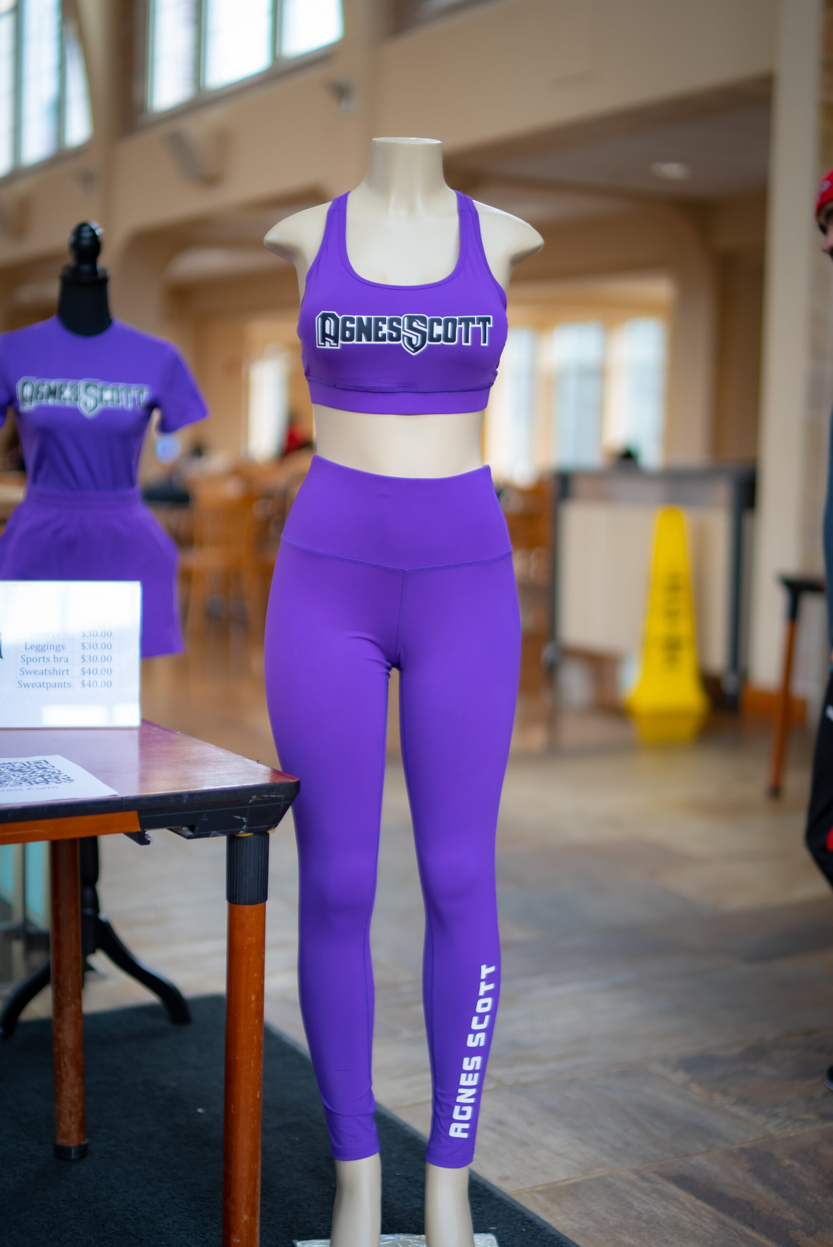
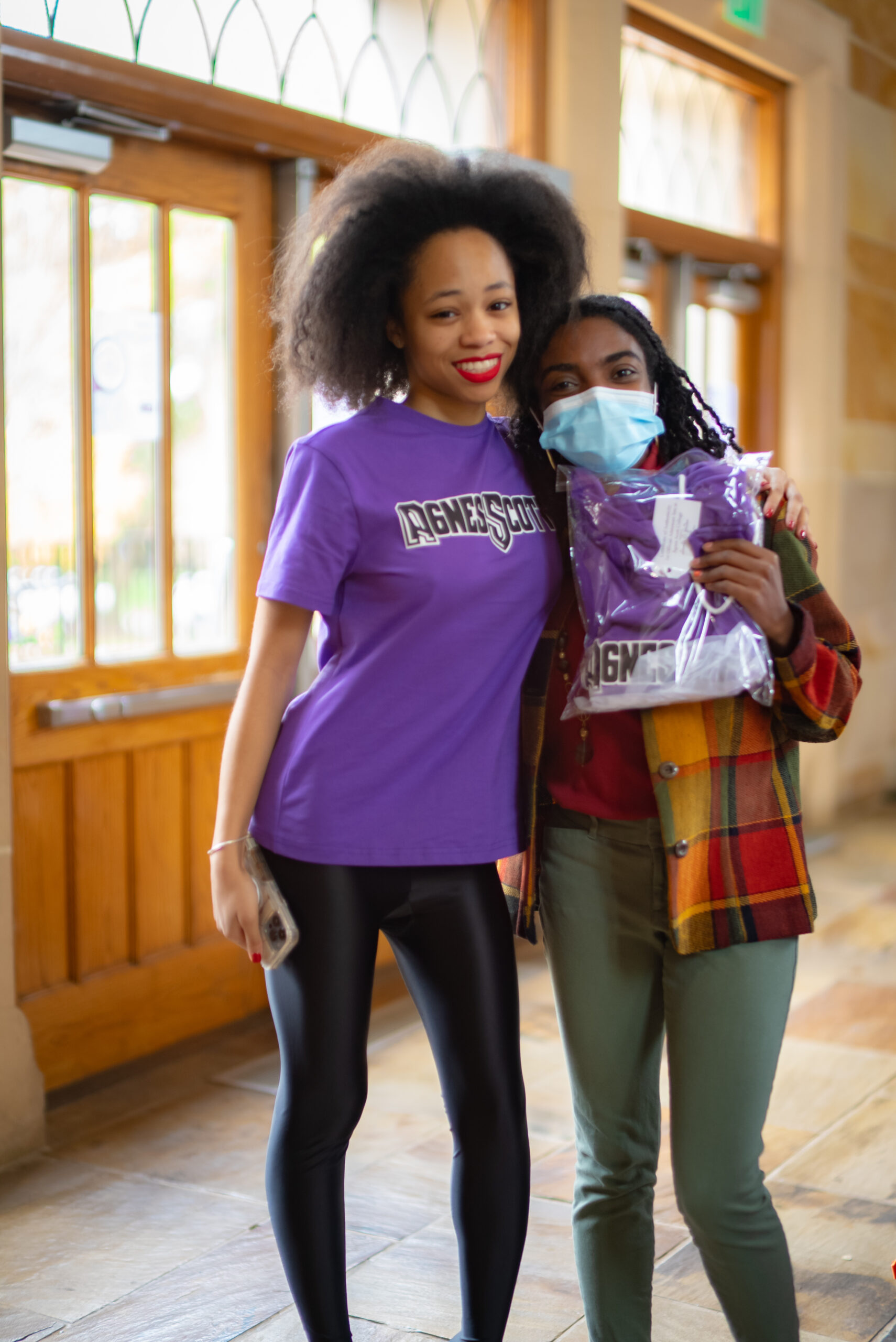
The clothes finally came in. We are launching them tonight at midnight madness. I am very excited and nervous to see the school’s reaction to the new collection. This week we read the chapters from the book Brand Story on Ralph Lauren and Dolce & Gabbana. I learned the strategies both companies used to become successful. We also watched White Hot where the founder of Abercrombie and Fitch created imagery around white men with very athletic bodies to create a company around unrealistic body standards. This documentary was a great documentary because it shows how people can feed into any idea even though they are just buying a basic T Shirt.
October 31, 2022
The debut of the collection went well. We did not sell anything during midnight madness, but we received great feedback. I ended up selling again at the fall festival and we got some good sales. The point of sale system that the school has is not good and it needs to be upgraded. This brought some difficult exchanges when the card machine did not work, forcing us to lose sales. This week I read about MAC, Vera Wang, and LuluLemon. I really enjoyed learning about these brands specifically LuluLemon because they sell athleisure wear and this is my goal. I really liked how they had the business model of yoga associated with the brick and mortar stores to make yoga seem more approachable. I also watched the film Fresh Dressed which I really enjoyed seeing the evolution of hip hop into fashion houses. I was not satisfied with how all of the fashion houses fell. I am still concerned about that.
November 7, 2022
This week was really crazy because we ended up planning a fashion show in a week. I had to find models. I wanted to represent all the different types of people on campus while keeping it short to eight minutes. Coincidentally there was a fashion show happening for global night the same night and they had already ordered a stage. They will put the stage up early so we could use it during lunch. I decided to do it during lunch so it could be during the peak hour of traffic. I had my mother and my grandmother volunteer to come help. We enlisted models on campus including students, faculty and staff.
November 14, 2022
The Fashion show is tomorrow and I am very busy getting everything together. I had to make sure everyone felt comfortable in their clothes. We did a quick rehearsal to show everyone when to come. The show had to start at exactly 12:00 and end at 12:08 because the models had to go to class. My mom had the idea to make the models wear fun outfits with their clothes. I encouraged them to wear blazers, sunglasses, purses, hats, and whatever else they thought would make the outfit look chic and match their personal style. I was also able to get my friend to come take professional photos. We had an announcement put in the Irvine and blasted it on social media. These were different marketing strategies I learned from studying marketing this semester.
November 29, 2022
The fashion show was a success. All the models came on time except for one, but it didn’t make a difference. We had a great turn out and received so much support from the school. We sold over one thousand dollars in revenue. We received great publicity on social media as well because people posted their purchases. People really enjoyed the show and liked how it involved staff from the dining hall, the mailroom, professors and students. I did not allow the models to keep the clothes and in return they loved the clothes so much that some of them ended up buying some clothes. People really loved the mannequins as well and they boosted sales because people could see the clothes clearly. It was a great experience, but the point of sale was still an issue. Without the card reader it made it difficult to process money. I learned in this experience that this was a lot of work.
December 5, 2022
Overall this semester I learned the importance of marketing. I feel like I am just getting started. Studying while practicing marketing gave me some invaluable experiences. I was not just learning from the textbook but I was actually implementing the lessons I learned in real time. I was able to make mistakes and recover quickly. This was a great opportunity for me to learn the importance of marketing and how essential it is in every business. I also realized that I am not sure if this business model is the right one for me. I definitely need more help because I cannot do all of this on my own. I learned this semester that I am ready to become an entrepreneur full time and I will not be working anywhere. I realized a masters program was not for my career path. I realized that I was never going to be ready to start my own business and that there was never enough books or time to prepare me. The best lessons happen by doing and making mistakes. I will continue this into my next semester as I take on new clients and expand my business.