
For the final project, I was really excited to make a book cover. I have always wondered how illustrators make book covers. The cover of a book gives the first impression of a book to a reader. The famous saying, “Don’t judge a book by its cover,” shows how influential covers are to a reader. I chose to do one of a my favorite books called Quicksand by Nella Larsen. The book is about a woman who is half white and half black. Her mother is white and from Denmark. Her father is an African American. Throughout the novel, the lead character, Helga, struggles on whether she is black or white. She struggles on whether or not she wants to marry a white or black man too. She deals with a lot of depression.
This cover is inspired the Romare Bearden collage style. Bearden cut of faces and put them together to make one face out of many faces. He used grays and other vibrant colors in his work. He also used graphics. His typography includes images and graphics. In my cover, there is a woman smiling on one side of her face and crying on the other. The sky in the background is cloudy, but there is a sun in the corner. The sun in the corner juxtaposes the cloudy background revealing the characters inner conflict. The wedding dress signifies the pressure she feels by society to get married.
This cover is inspired by Josep Renau’s work. His work includes warm colors and black and white. He has celebrities like Marilyn Monroe in his work. Vivien Leigh is pictured on the cover. Leigh starred in Gone with the Wind, a pivotal film in the 20th Century. Monroe and Leigh were both monumental actresses. Like Renau, I wanted to use a woman of great influence in my work. Renau also used fire in his work so I included fire. I put the ring on her ring finger to signify Helga, the main character in the novel’s struggle with marriage. The expression on Leigh’s face is not happy which is what is normally expected with a marriage. The hand reaching out hand signifies a cry for help.
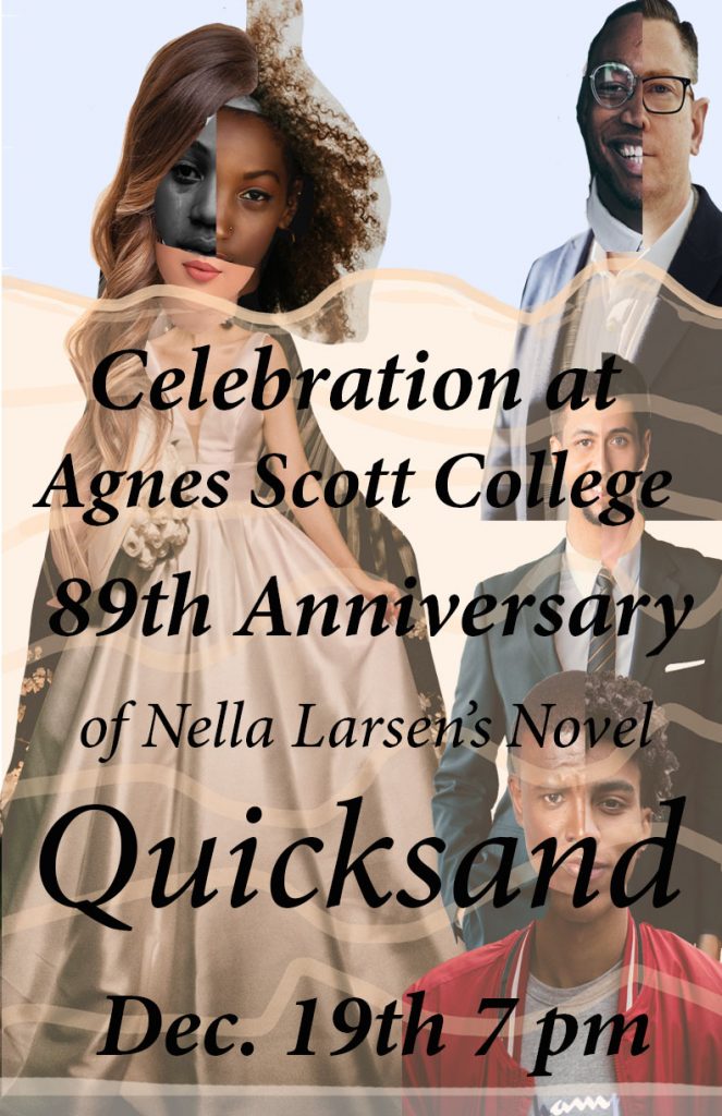
In this design for the flyer, I used Romare Bearden as the inspiration. He uses cut up faces to bring together one face. I used different and different bodies to align with his method. I also used different scales like he did as well. The different faces are for the different identities she is. She also struggles with choosing a white or black husband.
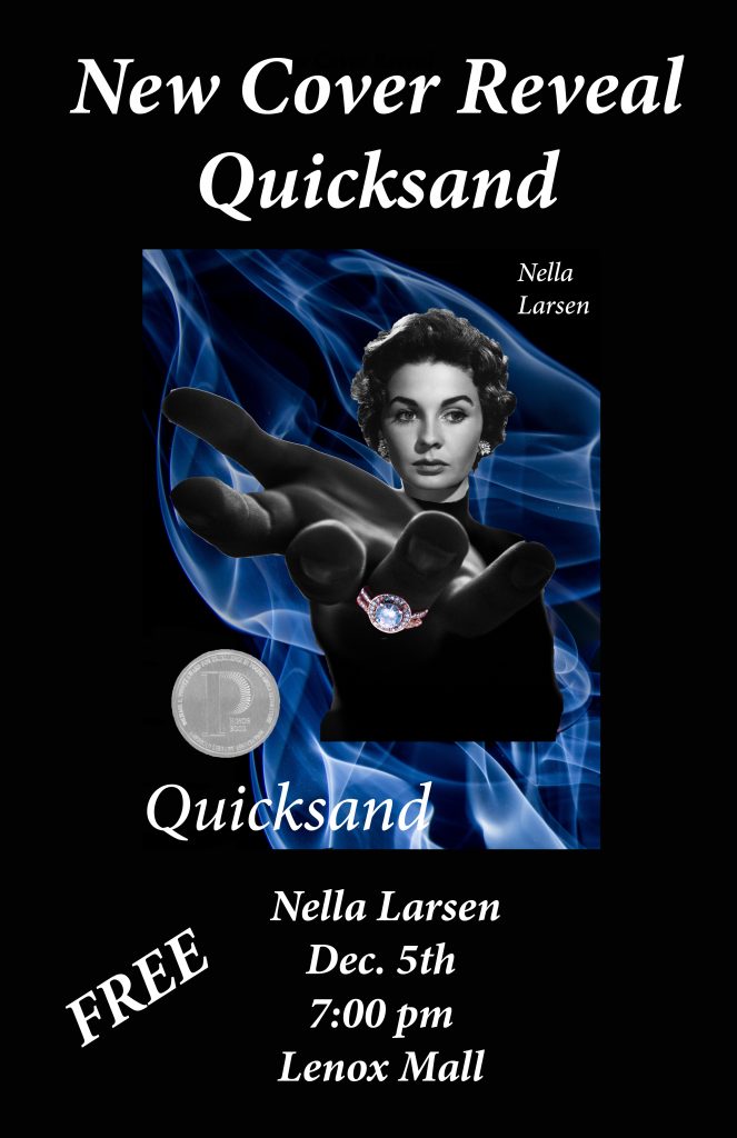
This flyer is also modeled from Josep Renau’s work.
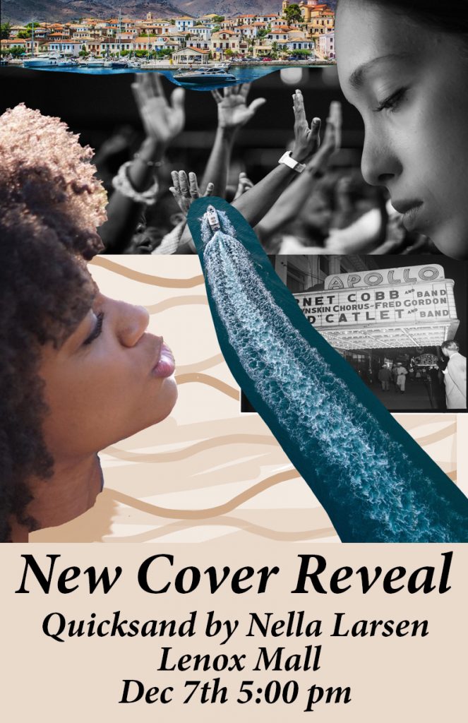
Here is another poster I did. Vertov used facial features and consecutive pictures that followed down the page. His dynamic composition was something I was trying to emulate. At the top of the picture there is a picture of a foreign country. The country made me think of Denmark where the main character is from. The boat that goes completely through the page signifies her constant traveling throughout the novel. The hands in the air signify worship. The main character deals with issues with religion. The woman looking down in the top right hand corner symbolizes Helga’s mother who is dead looking down on her. The woman in the bottom right corner symbolizes Helga talking to her mother and asking her for guidance. Also her constant identity issue. The Apollo theatre in Harlem represents her acceptance in the black community and her enjoyment of her time in Harlem during the 20’s. The tan background signifies the Quicksand that she constantly feels she is in.
The hardest part of the project was trying to recreate another artist style without it looking redundant and unoriginal.
The best part of the project was being able to incorporate a novel I have enjoyed in the past into a project. That made the project more fun because I was able to revisit the novel and get ideas.